Breathless Nomad, a tour activities operator specialising in quad biking tours in Cape Town required a new brand identity and website that communicated their brand messaging and offered an exciting brand experience.
When the team from Breathless Nomad approached the WritersHand Studios team, they didn’t know what to expect, but they knew what they didn’t want and what their immediate challenges and concerns were. What they had was a brand that had already existed for only a year in a niche market that already had some steep competition. They initially approached our team for some assistance with their SEO (Search Engine Optimization) needs, but the brand itself needed a lot more than just improving their SEO. They needed a new visual narrative and a brand experience their customers would love.
What was important to them was that whatever we did, it had to communicate the brand’s messaging without eluding to something or services that the brand simply does not offer to customers. Additionally, the brand had to differentiate itself from its competitors in a unique way. To achieve this, we had to take a look at the brand holistically, from the brand identity and visual brand assets to the business services and product offering and the way in which they marketed.


We decided that it’s best to start from the beginning and take a look at the brand identity and perhaps refresh the logo slightly. To our surprise, the Breathless Nomad team advised us that they were not 100% happy with their logo and that, in fact, their logo was not unique and authentic. We simply had to scrap the original logo.
Additionally, the structure of the existing website did not offer an engaging user experience and did not align with the ethos of the brand. Upon further inspection of the UX and UI, we realised that the former web developer(s) did not map out the content in the best interests of the brand. We had to redesign the entire website and rebuild it on an improved framework.

We always start our brand identity design with an audit of the brand’s messaging. This helps us understand what the brand is, who it’s target audience is, the service it offers and the problem it solves. By exploring this, we were able to find out what was missing from the brand, and the words adventure, modern and exciting came up quite a few times in discussion. We decided that the best way to apply modern touches would be through the use of modern typography. We also wanted a font that was edgy and that had a good variety of weights, glyphs and numeric figures. This was important as it would later be used on a variety of applications.
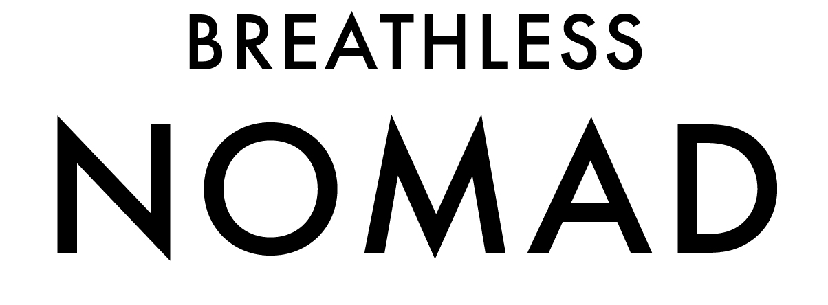
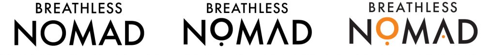
We chose Futura PT as the brand’s base font for a variety of reasons. We loved how there were no serifs, the fact that the edges of certain letters were sharp and elongated, and that O’s were perfectly round. Next, we needed to make the wordmark distinct and unique. Nomads are effectively wanderers, much like gypsies, who travel from place to place for their tribes to settle. We needed to include tribal symbols or glyphs somehow to capture this, but without making the brand identity look juvenile to the point where the logo looked cliché.
By playing around with circular shapes, we turned the “O” into a glyph to add character by simply adding a tiny dot to the bottom, and then dropped the connecting stroke in the letter A and replaced it with a smaller iteration of the dot. We also identified orange as a bold brand colour, since it was striking enough to stand out on light and dark applications, and it had a luminescence about it that made it seem almost like reflector tape or neon. The orange worked well, especially when set against the dunes and the landscape that many of the adventure activities took place.

Now that we had the wordmark established, we needed to start the work on the abstract mark since the client requested that the logo be constructed as a “combination mark” logotype. A Combination Mark is essentially a word mark and abstract mark combined to form a complete logo.
A few abstract symbols came to mind in our sketches, including a compass, and the sun and it definitely needed the silhouette of a nomad wrapped in nomadic apparel. After about 2 reverts with our client, we finally nailed it by combining the first and second concepts.
The brand identity came together beautifully and communicated the emotive message that the client was looking for – adventure! This iconography was paramount to the success of the brand messaging and pulled the visual narrative together in a unique way.
Now that the brand elements were finally approved, it was time for us to move on to the application – starting with the website. Look out for Phase 2 of this project, which we’ll be sharing later this week.
Stay up to date with the latest news, insights, project updates and events here at WritersHand Studios.
Website Designed by WritersHand Studios
| Cookie | Duration | Description |
|---|---|---|
| cookielawinfo-checkbox-analytics | 11 months | This cookie is set by GDPR Cookie Consent plugin. The cookie is used to store the user consent for the cookies in the category "Analytics". |
| cookielawinfo-checkbox-functional | 11 months | The cookie is set by GDPR cookie consent to record the user consent for the cookies in the category "Functional". |
| cookielawinfo-checkbox-necessary | 11 months | This cookie is set by GDPR Cookie Consent plugin. The cookies is used to store the user consent for the cookies in the category "Necessary". |
| cookielawinfo-checkbox-others | 11 months | This cookie is set by GDPR Cookie Consent plugin. The cookie is used to store the user consent for the cookies in the category "Other. |
| cookielawinfo-checkbox-performance | 11 months | This cookie is set by GDPR Cookie Consent plugin. The cookie is used to store the user consent for the cookies in the category "Performance". |
| viewed_cookie_policy | 11 months | The cookie is set by the GDPR Cookie Consent plugin and is used to store whether or not user has consented to the use of cookies. It does not store any personal data. |